CONVERTING
YOUR
POWERPOINT
DECK TO A
QWILR PAGE
(Or Google Slides, or any other
slide deck.)
So you have a slide deck that you want to turn into a Qwilr Page. This guide offers some tips.
If this is your first Qwilr Page, we also have a Getting Started Guide.
Step 1: Gather your branding elements
When you first set up your Qwilr account, we'll pull in your main brand colors and fonts from your email domain. But you might want to update those.
- You’ll need the hex color code for each of your brand colors. (You can add up to 7 in Qwilr.)
If you don’t know the hex codes, you can use a free online tool to find them.
- You’ll also need 1-3 fonts. Depending on your plan, you'll have access in Qwilr to Google Fonts, Adobe Fonts, or custom font uploads.
Here's how to add your brand elements to Qwilr:
Step 2: What visuals will you need?
Qwilr Pages hold all kinds of visuals - images, videos, maps, tables, and even embedded content from other websites.
It’s a good idea to collect all the visual elements you want to use ahead of time - that will help you plan your Qwilr Page.
You’ll probably also want to include your logo, so make sure you have a .jpg or .png file handy.
Tip: Getting the images from your slide deck
If you have the original image files, they’ll look best in your Qwilr Page. But if not, you can try pulling them from your slides.
- In PowerPoint, right-click on an image. Then choose Save as Picture from the menu.
- In Windows, you can also use the Snipping tool to take screen captures of images.
- On Mac, you can type Shift-Command-4 to capture sections of your screen.
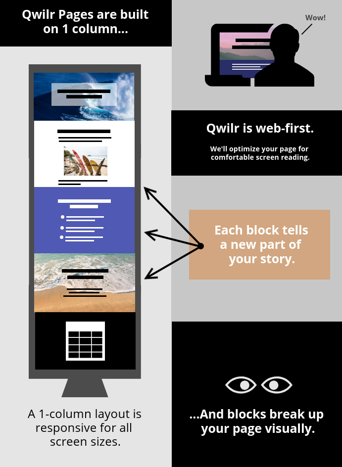
Step 3: Let’s consider the layout
Now that you've collected the foundations, let's think about the layout of your new Qwilr Page.
A deck and a Qwilr Page are quite different. That's because Qwilr is built for responsive layout.
Slide Deck | Qwilr Page | |
The size of your slides is always the same. | A Qwilr Page might be viewed on a large desktop monitor or a phone screen. It has to be flexible. | |
Each slide expresses one idea, and your client views each slide separately. | A Qwilr Page is continuous, and your client will scroll through. Each idea flows into the next. | |
Slides are always in horizontal format. | Your Qwilr Page might be seen in a vertical format, like a mobile device. (That flexibility, again.) |
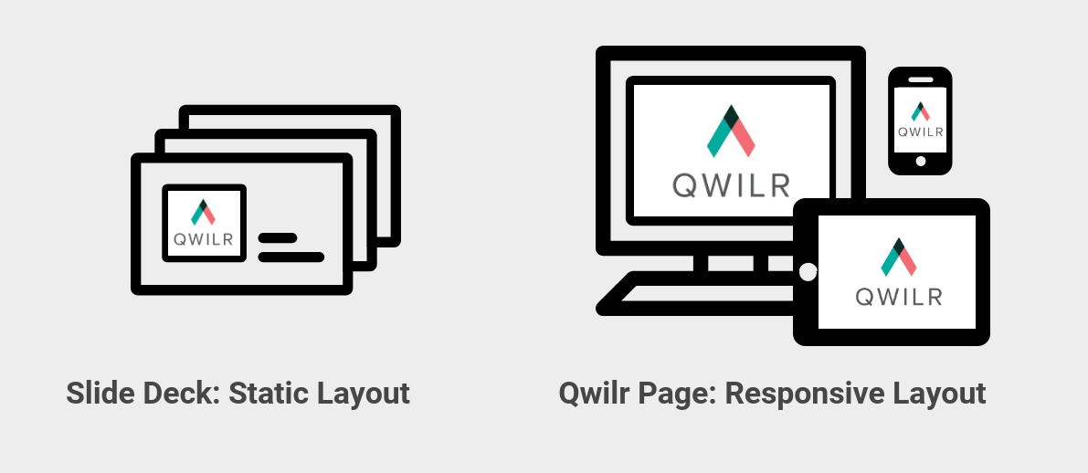
...So you won't be making an exact duplicate of your deck here.
You'll be capturing its essence in your Qwilr Page, and adjusting one format to the other.
Tip: Working with a responsive layout
Some things to remember as you build your page:
(Incidentally, you can see all these ideas at work here in this very page.)
Adding some fun to your page layout
Web-based pages allow you to do lots of interesting visual things. Try these features:
2-column widget
- Add a 2-column widget (like this one) so you can place text and images side by side.
(Or, two images side by side, or two columns of text.)
Accordion widget
Use accordion widgets to add expandable sections to your page. Try clicking the buttons to open and close the sample below!
Table
Try adding a table (like the one below) to your text. You can have as many rows and columns as you need. It's a great way to organize complex information.
Type | Primary Criteria | Is it Awesome? |
Chocolate Chip | Chips made of chocolate | Definitely |
Snickerdoodle | Cinnamon sugar | Yes indeed |
Oatmeal Raisin | Raisins | Sure |
Macaroon | Coconut | Absolutely |
Animations
You can add a little motion to any block in your page. Animations help to subtly focus your client's attention. You might have noticed some in this page.
Let's see these ideas in action!
Below is a sample slide deck. Take a look at the slides, and then you'll see how we used the same elements to build a Qwilr Page.
Now take a look at the Qwilr Page.
...And notice how we used the responsive layout.
- Instead of using one Qwilr block for each slide, we combined some slides into blocks. Blocks are flexible - you can have as much or as little content as you need.
- We also embedded some of the slides right into the page. You can do that with Qwilr!
- We used the images from the deck flexibly, placing some inline and using others as Splash backgrounds.
- We added a navigation bar to the page as a Table of Contents.
💡Tip: Splash images vs. inline images
Splash Blocks (like this one) are part of what makes Qwilr's layout responsive.
Splash images are backgrounds. They'll be cropped differently on different-sized screens.
Content near the edges of a Splash image may be cropped out on smaller screens.
If you need to see 100% of your image on all screens, it's best to add it as an inline image, like you see below: